The Psychology of Color: How to Choose the Right Palette for Your Website
Understanding the psychology of color is crucial for designing an effective website that resonates with your audience. Different colors evoke various emotions and can influence users' behavior and perception of your brand. For instance, blue often conveys trust and reliability, making it a popular choice for financial institutions, while red can trigger excitement and urgency, perfect for sales promotions. To delve deeper into the impact of color on consumer behavior, check out this insightful article on Color Psychology in Marketing.
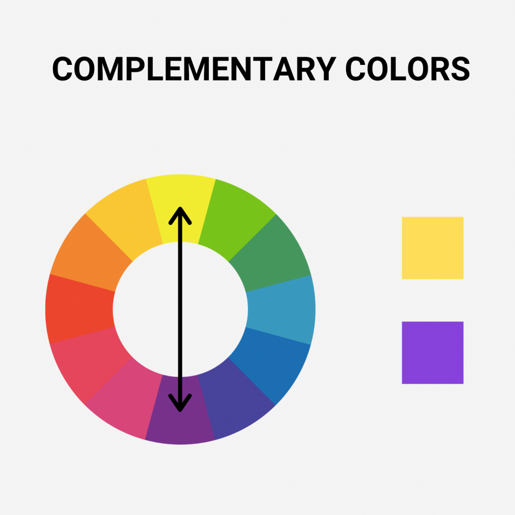
When selecting your website's color palette, consider your target audience and the message you want to convey. A well-thought-out color scheme not only enhances visual appeal but also strengthens brand identity. For example, a website aimed at a younger demographic might benefit from vibrant and energetic colors, whereas a site focused on wellness might opt for softer, calming hues. To learn more about creating a harmonious color palette, explore this comprehensive guide on Color Theory for Beginners.
Color Contrast and Accessibility: Ensuring Your Website is User-Friendly
Color contrast is a crucial factor in web accessibility, as it plays a significant role in how users perceive and interact with your website. Ensuring adequate contrast between text and background colors not only enhances readability for all users but is particularly vital for those with visual impairments. According to the Web Content Accessibility Guidelines (WCAG), a minimum contrast ratio of 4.5:1 is recommended for normal text and 3:1 for large text. Failing to adhere to these standards can alienate a significant portion of your audience, making it essential to utilize tools that test color combinations effectively.
Implementing accessible design strategies can vastly improve user experience. Use color contrast checkers to evaluate your website's color palette and ensure it meets the required standards. Furthermore, provide alternatives such as text descriptions or style adjustments that cater to users with different visual abilities. Remember, accessibility is not only about compliance; it is about creating an inclusive environment that welcomes all users. By prioritizing color contrast and accessibility, you are fostering a user-friendly website that encourages engagement and retention.
Are You Using the Right Colors? Key Factors That Impact User Experience
When designing a website, the color scheme plays a pivotal role in shaping the user experience. Colors can evoke emotions, influence perceptions, and even dictate how users interact with various elements on the page. For instance, using warm colors like red and yellow can create a sense of urgency, which may be beneficial for call-to-action buttons. In contrast, cooler colors such as blue and green promote a feeling of calmness and trust. According to a study by Color Psychology, over 90% of consumer judgments are made based on colors alone, emphasizing the importance of selecting the right hues for your brand.
Moreover, the contrast between text and background is another key factor in determining a site's usability. Poor contrast can lead to readability issues, causing frustration and ultimately driving users away. For optimal user experience, it’s advisable to maintain a contrast ratio of at least 4.5:1 for normal text, as recommended by the W3C Web Content Accessibility Guidelines. Additionally, considering color blindness and other visual impairments is essential for inclusivity. By thoughtfully integrating color into your design, you can enhance engagement and create a more positive experience for all users.